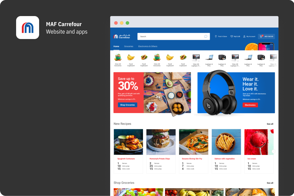
MAF Carrefour App
The brand was launched in the region in 1995 by Majid Al Futtaim, which is the exclusive franchisee to operate Carrefour in 38 countries across the Middle East, Africa, and Asia.
Users Pain Points
• Homepage fails to orient users and get them started.
• Search and browse did not help users find the product quickly
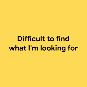
• Dificult to find MyCLUB card and discounts
• Search and browse did not help users find the product quickly
• Dificult to find MyCLUB card and discounts
Confuses Users
• Product labels without details
• Change quantity of the products
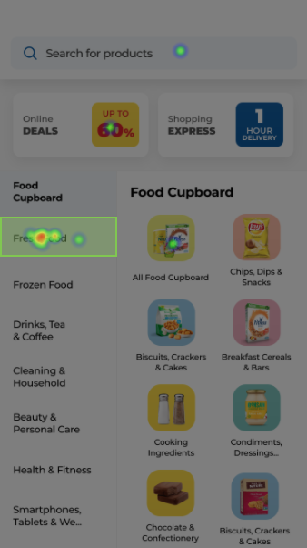
• Often participants did not scroll right to see more categories
• Change quantity of the products
• Often participants did not scroll right to see more categories
Slows Users
• Absence of visual search results on mobile
• Heart icon and list management
• 15/20 participants preferred searching for a product instead of going through the categories.
• Heart icon and list management
• 15/20 participants preferred searching for a product instead of going through the categories.
Stop Users
• Difficult to use categories
• Absence of visual search results on mobile
• Absence of visual search results on mobile
Business Pain Points
• > 60% of use cases are to show cashier barcode at checkout.
• > 90% of complaints are around MyCLUB
• Shop pages represents only 0.73% of the total views
• > 90% of complaints are around MyCLUB
• Shop pages represents only 0.73% of the total views
Business Requirements
• Increase the conversion rate in +0.5%
• Increase of app's MAUs and retention rate
• Easy customization with dynamic components
• Follow ecommerce trends by displaying at least 2.5 product cards per scroll (Baymart Study)
• Decreased design to dev handoff time
• Increase of app's MAUs and retention rate
• Easy customization with dynamic components
• Follow ecommerce trends by displaying at least 2.5 product cards per scroll (Baymart Study)
• Decreased design to dev handoff time
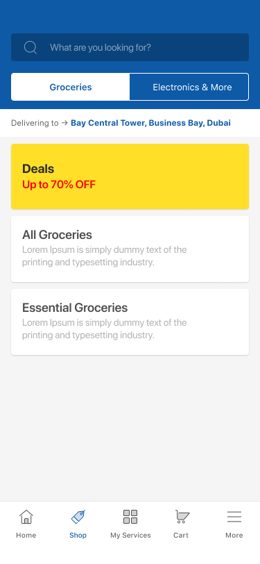
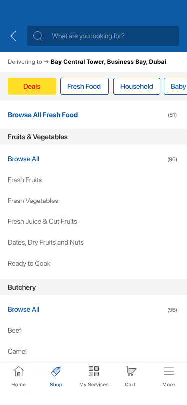
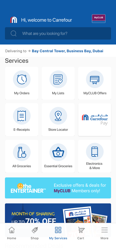
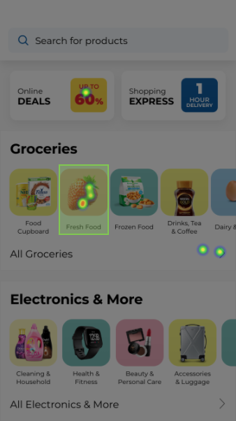
Redefining the architecture of the app
Questions for the team
1) If you had no emotional or professional attachment to this design, how would you critique it?
2) What do you think the designers at our competitors say about this design?
2) What do you think the designers at our competitors say about this design?
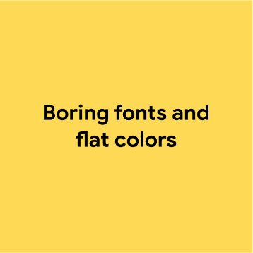


What’s the inverse of it?
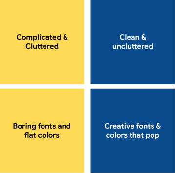
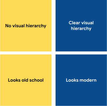
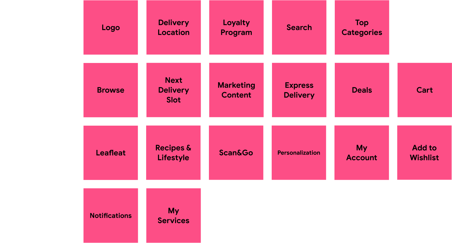
Cutting the clutter
Must Have: Most vital. Can't work without.
Should Have: Important but not absolutely vital
Could Have: Nice to have
Won't Have: Provides little or no value
Should Have: Important but not absolutely vital
Could Have: Nice to have
Won't Have: Provides little or no value
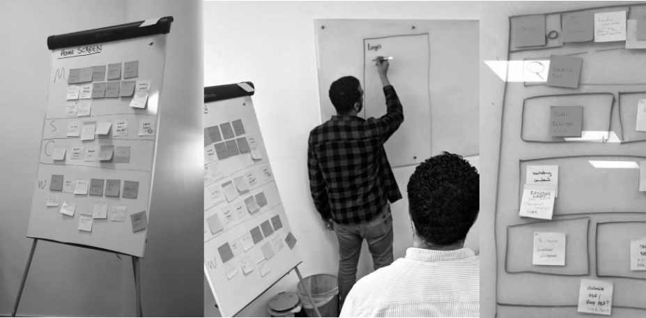
Defining design solution
The first wireframes explored a simple and consistent solution for the main pain points reported by users and business requirements.
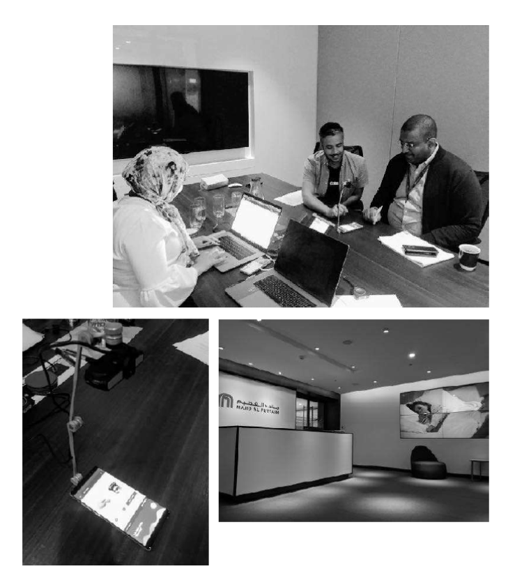
In-person Interviews
Objectives
• First impressions
• Which of the designs you most like to use
• Words would you use to describe your preferred design
• Products and categories findability
• Which of the designs you most like to use
• Words would you use to describe your preferred design
• Products and categories findability
Participants & Methodology
• 30 participants
• Half In-house based, half outside
• Moderated, face to face
• MAF Carrefour online and offline customers
• Mix of gender
• Different nationalities
• 3 teams, 1 note taker, 1 moderator
• Half In-house based, half outside
• Moderated, face to face
• MAF Carrefour online and offline customers
• Mix of gender
• Different nationalities
• 3 teams, 1 note taker, 1 moderator
Results
• Two designs were selected by users.
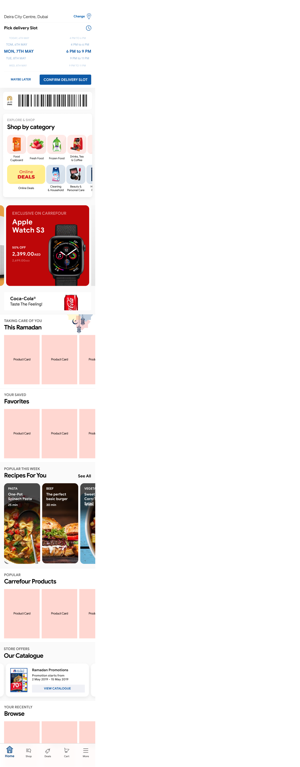
Online user testing
Using Usability Hub, it was possible to quickly validate the findability between two navigation structure A/B.
A total 60% of participants completed all steps in an average of 15 seconds.
A total 40% of participants completed all steps in an average of 41 seconds.
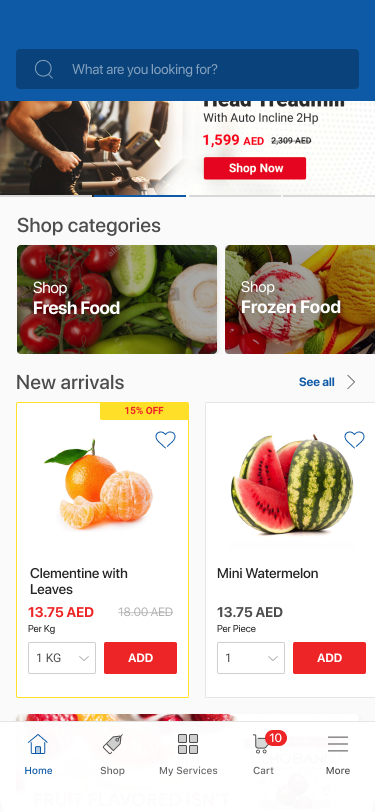
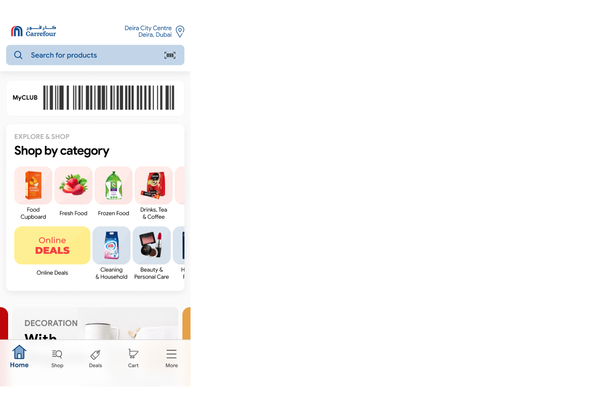
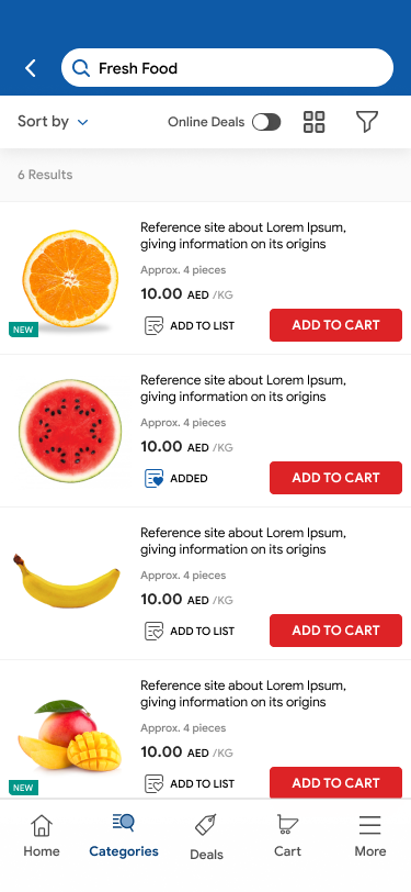
Final Design
A new squad called “Discovery” was created in order to lead the new design system, during the period of 6 months untill the app release date.
Achievements
Business KPIs & Transformation Journey Results
The new design was expanded for 8 new countries
User Testing Findings
Design:
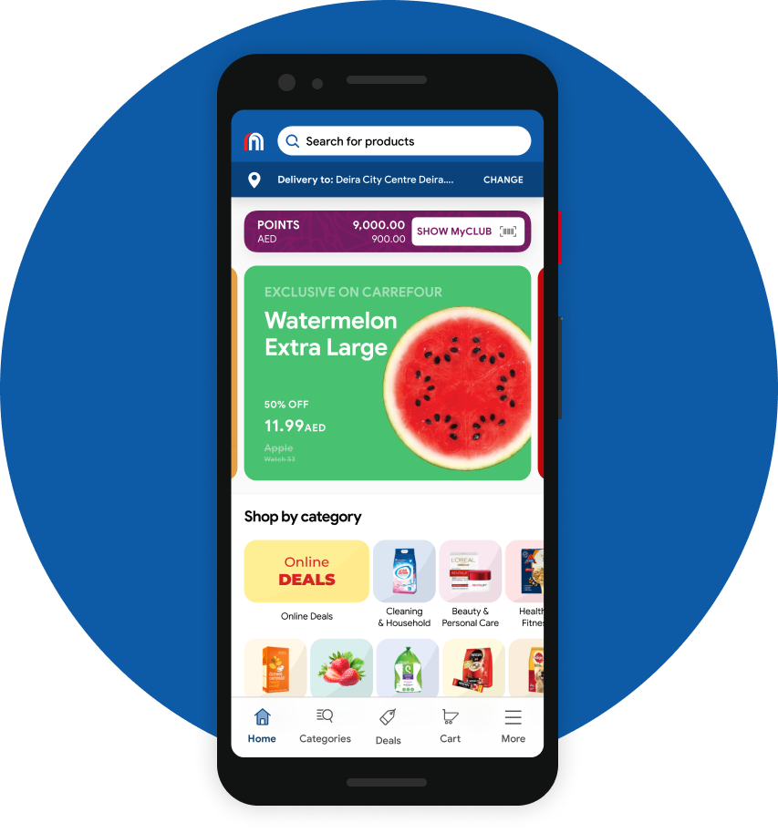
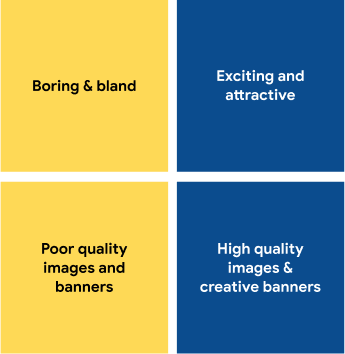
Everyone loved the homepage with enthusiasm for
the pastel colours and the grid layout of the categories.
Stands out:
Everyone loved the homepage with enthusiasm for
the pastel colours and the grid layout of the categories.
Stands out:
At first glance the hero banner and online deals
grabbed their attention.
Layout:
grabbed their attention.
Layout:
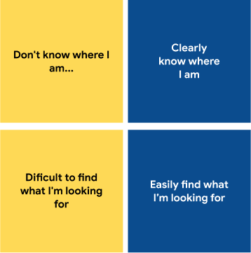
They felt that the layout of the page was clean,
organised and easy to use.
Content:
organised and easy to use.
Content:
Participants were overwhelmed by all the options
when the were promoted to explore the whole page.
when the were promoted to explore the whole page.
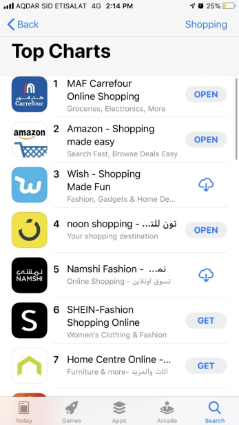
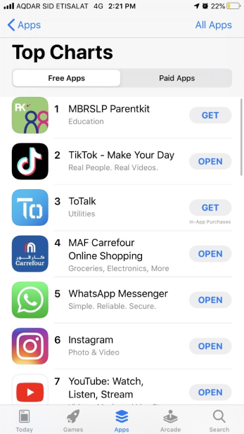
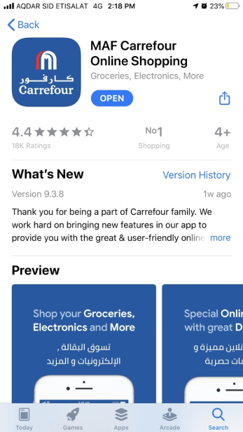
Top Charts on App Store
• Top 1 shopping app in January, 2020
• From 1M to 5M+ downloads
• From 1M to 5M+ downloads